COVID-19's Reach: Real-World Data vs. Wikipedia Pageviews

How was the evolution of the COVID-19 pandemic reflected in Wikipedia pageviews related to the disease?

9 minute read

Continue the quest

Exploring the maps


Alright, our datasets are complete, clean and ready to be used. Now, let’s try to get a feeling for how the pandemic propagated in the physical world and how it propagated in our virtual wikipedia world!

Where it all began: the first wave

For the first part, we are going to look at the covid-related deaths, as they provide a metric that is independent of the testing intensity of countries. For the second, we are of course looking at the pageview statistics for the covid-related articles. How do the propagations maps look like ? Let’s see!

We plot the relationship between the evolution of the COVID-19 pandemic and Wikipedia pageviews related to the disease by comparing the cumulative number of COVID-19 deaths per country to the cumulative number of Wikipedia pageviews. Both numbers are normalized per 100,000 inhabitants for each country. The period we plot (22 of January 2020 to 29th of August 2020) roughly corresponds to the first wave.

There are multiple interesting observations that can be made from the evolving maps. The most significant event being the introduction of lockdowns in Europe around the 18th of March 2020. This date marks the moment when the Wikipedia pageviews start to drastically increase.

The pageviews of COVID-related articles vary among different countries. Germany and the Czech Republic have high pageviews at 38k and 34k per 100k inhabitants respectively, but low numbers of deaths at 11 and 4 per 100k, while Sweden has low pageviews but high numbers of deaths: 5.8k pageviews for 59 deaths per 100k inhabitants!

This may be due to the fact that the Swedish Wikipedia has few Covid-related articles (17), so Sweden's inhabitants may be documenting themselves using the English Wikipedia. However, considering the number of articles in Czech (48), it is difficult to explain the four-order-of-magnitude difference between the pageviews per 100k inhabitants of Sweden and Czechia solely by the difference in the number of articles. Maybe the Swedes didn't care as much about COVID?

The pandemic didn't stop after the first wave

Before going into a deeper case study, let's take a look again at the whole pandemic from January 2020 to July 2022 to understand general dynamics of information seeking behaviour around the world. For that, let's visualize the monthly evolution of pageviews, COVID cases and deaths. Below, we have compiled three key moments in the evolution of the pandemic. For the full video of the BarRace, click here.

First wave: 02.2020 - 07.2020

During the first wave in early 2020, we see that the disease spread first in Asia (China, South Korea, and Japan had the highest number of cases in February). However, in terms of pageviews, European countries had the highest number of views, with Germany and Czechia having more than 150k pageviews per 1 million inhabitants. When the pandemic spread to Europe in March and April, we see a significant increase in the number of deaths, cases, and pageviews. Italy and Sweden had the highest number of deaths and cases, while Germany continued to have the highest number of pageviews. From the first wave, we can see that the pageviews of the top country decreased as the population became more informed about COVID-19 and did not feel the need to search for information as frequently.

Second wave: 09.2020 - 04.2021

During the second wave at the end of 2020, the virus spread widely in Europe, with the top 5 countries for deaths being European countries, with the exception of Israel. Czechia, and the Netherlands are among the top countries for deaths. Unlike the first wave, this wave does not appear to be as global, as there are no Asian countries in the top 10 throughout the wave. It is all fun to notice that Germany and Czechia are again among the top 3 countries in terms of pageviews. Their populations are becoming COVID experts!

Last wave: 04.2022 - 06.2022

The last wave seems more global as we can see country from all over the world in the top 10 of deaths and cases (South Korea, Germany, Russia, Finland). The numbers of pageviews are ridiculous compared to the one at the beginning of the pandemic. Germany who had also the 1st place in 2020 has fallen from 150k to 2k pageviews per 1M inhabitants.

Looking at the different bar races, we have the following general observations:

  1. COVID cases and deaths are strongly related, with an increase in cases leading to an increase in deaths with a small delay,

  2. Different waves of the pandemic occurred at different times in different countries. European countries had their first wave in March 2020 and then another important wave in November 2020. For West Asian countries such as Kyrgyzstan, Kazakhstan and Israel the first wave appears later in July 2020 and for Botswana only in March 2021,

  3. There is a strong relation between the evolution of the pandemic and number of pageviews related to it during the first wave, but this relation does not remain constant throughout the pandemic. One can illustrate that with Italy that arrived at the same time in the top 3 countries in the different bar races and dropped down after everywhere,

  4. Some countries, such as Germany and the Netherlands, remained consistently high in terms of pageviews per million inhabitants despite relatively low numbers of cases and deaths,

  5. Overall, one can observe that the pageviews are more consitent over the whole period,

  6. China was never among the top 15 countries in terms of pageviews, cases and deaths, possibly due to government censorship of information related to COVID-19.

Exploring the data


Now that we have a sense of the evolution of the pandemic and the digital propagation over the last two years, let's go deeper in the analysis by studying the evolution of the regression by windows of 60 day that relates these two dataset by country. For that, we fit a linear regression on the cumulative wikipedia pageviews and the cumulative deaths per country adding an intercept, and we plot the evolution of the fitted line through the time.

Looking at this Figure, one notice that the slope of the line decreases with the time. It passes from 81.01% (p-value: 0.03) to 5.52% (p-value: 0.67). These values show that the earlier in the pandemic we were, the higher was the relation between COVID-19 deaths and wikipedia pageviews. However, with the arrival of the new waves, it decreases and the p-value of 0.67 shows even that we cannot reject the "no slope" hypothesis the middle of 2021. It is possible that as people have become more familiar with COVID-19 and the measures taken to control its spread, their interest in reading about the topic has decreased. Additionally, it could be that the impact of COVID-19 on people's daily lives has decreased over time, leading to a decrease in their interest in reading about it.

Another point shown on the animated plot is the evolution of the position of each country related to the regression line. Some stay above it all the time such as Germany, others stay below such as Bangladesh and most of them varied their position such as Thaïland. Interestingly, their interest in COVID-19 does not increase even when they have a strong increase in death rates.

Overall, this plot highlights the interest or even the fear of the population towards COVID-19. In fact, the first group (above the line) will search more information on the COVID-19 than the mean for a fixed number of deaths. On the other hand, the second group (below the line) has less interest in this disease. Finally, the last group changes depending on the different waves in their countries.

Finally, we notice an increase of the slope of the regression line at the end of 2021 which coincides with the arrival of the Omicron variant and the third dose of vaccine in Europe.

To continue in this optic, we plot the moving average of the overall deaths and pageviews. Is the correlation between these two time series higher with the arrival of new waves in the pandemic?

Mobility timeseries

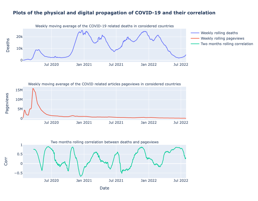
We can clearly recognize the 6 COVID waves we have had so far when looking at the peaks of death and, maybe more impressive, we have a strong visualization of how sudden and impactful the COVID-pandemic was. Pageviews skyrocketed for a brief period and reached record heights never to be seen again.

We also plotted the correlation between the two time series, and we can confirm that there is always a renewed interest for COVID for each new wave. Often, the correlation is highest just before the deaths are highest.

Now that we have observed a relation between digital and physical propagation, let’s analyze how the pandemic impacts mobility differentiating each population with the trust they have in their government.

How do our findings reflect in the populations behaviour?

Next page
Previous page